Brief
Queendom Farms is an urban flower and fruit farm based in Georgia, aiming to establish itself in an industry traditionally dominated by men. Founded by two women inspired and empowered by agriculture, they set out to create a strong and authentic brand identity of their own
Goals:
• Establish a bold, authentic brand rooted in empowerment and agriculture. • Differentiate Queendom in a male-dominated farming industry. • Create a visual identity that reflects both strength and natural beauty.Challenges:
• Entering a competitive space with limited existing brand recognition. • Balancing femininity and authority in a traditionally rugged market. • Communicating values of sustainability, empowerment, and quality in a cohesive way.Solutions:
• Developed a confident and earthy visual identity that honors both founders’ spirit and the land. • Crafted brand language that celebrates women in agriculture without relying on stereotypes. • Built a brand system that’s flexible across packaging, signage, digital, and farmers market presence.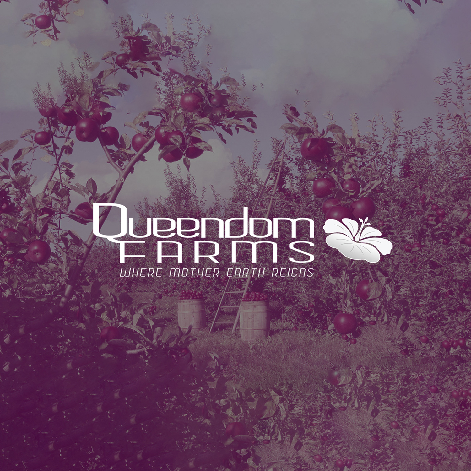
Moodboard
A visual collage capturing the brand’s essence—rooted in nature, empowerment, and modern femininity. — This moodboard set the foundation for Queendom Farms’ visual identity, blending organic textures, modern femininity, and themes of growth to visually align with the brand’s mission.
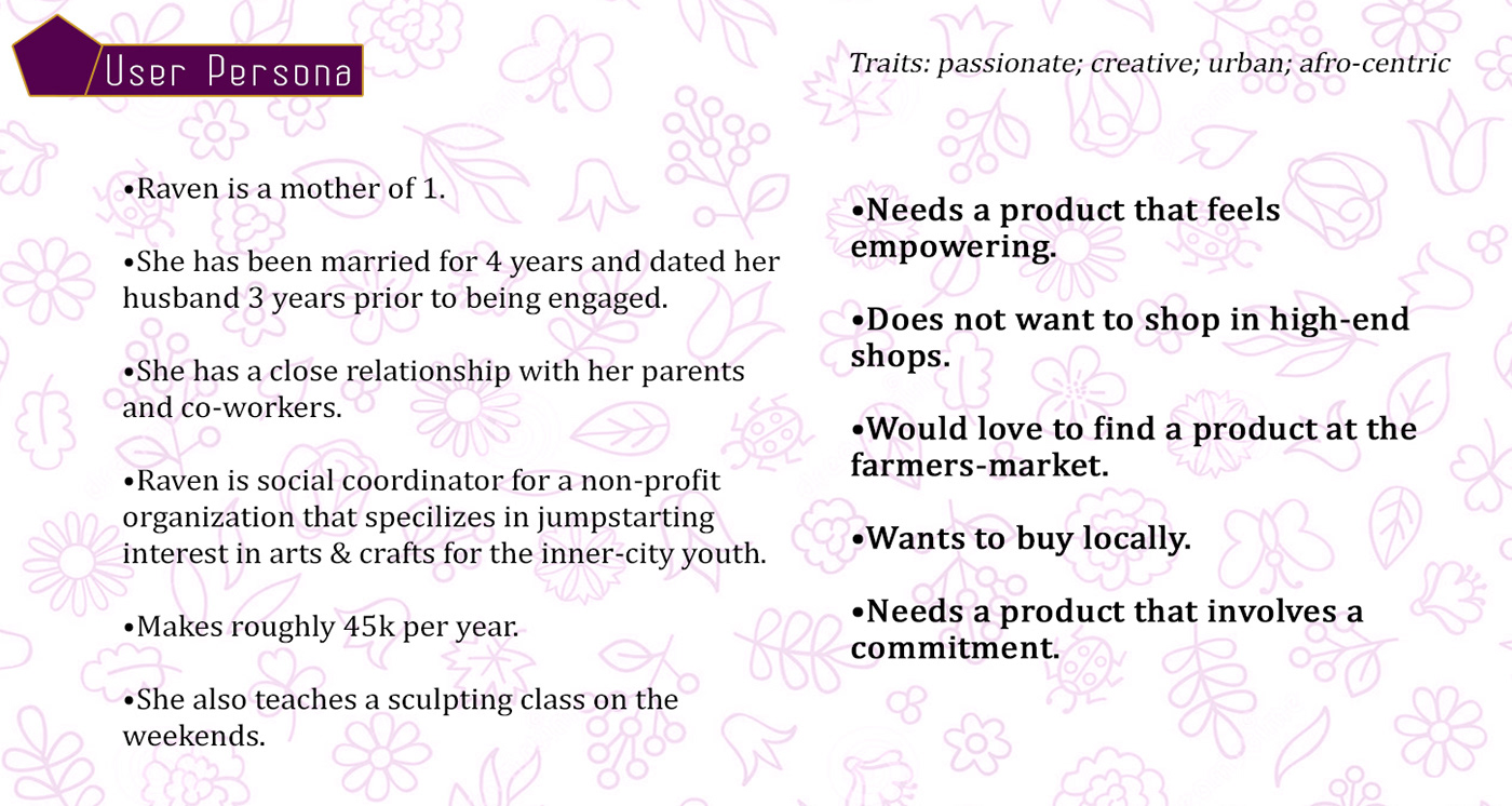
User Persona
A detailed profile outlining the brand’s target audience, needs, values, and buying behaviors. — Developed through audience research, this persona defines key motivations, lifestyle choices, and purchasing habit. This ensures that the brand resonates authentically with its core audience.
User Persona
A visual representation of Queendom Farms' ideal customer, crafted to guide brand decisions. — A composite visual of Queendom Farms’ ideal customer, helping guide tone, aesthetic, and messaging decisions from brand voice to UX flow.

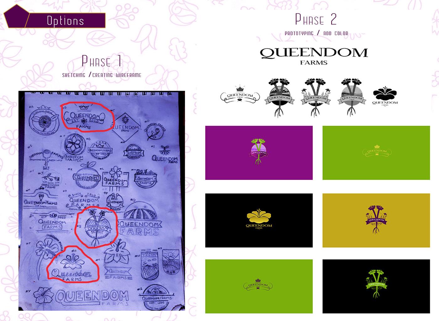
Sketch & Prototypes
Early logo sketches and digital prototypes exploring symbolism, balance, and brand voice. — With the initial sketches I wanted to explore symbols of strength and cultivation that evolved into digital prototypes that required being tested for its ingenuity, uniqueness, and scalability across real-world applications.
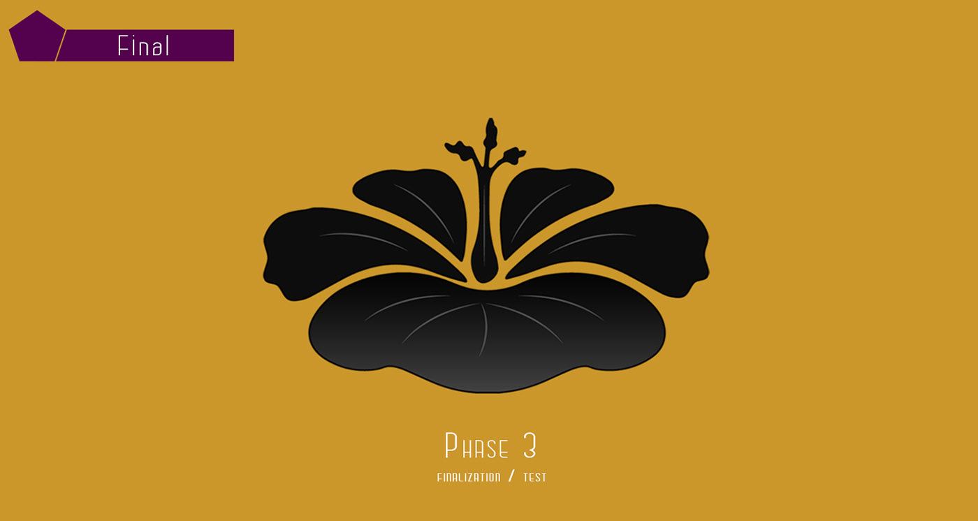
The Logo
The official Queendom Farms logo—a bold, elegant mark reflecting strength and authenticity. — The final logo balances regal strength with organic elegance—capturing Queendom Farms’ essence as a bold, women-led agricultural brand.
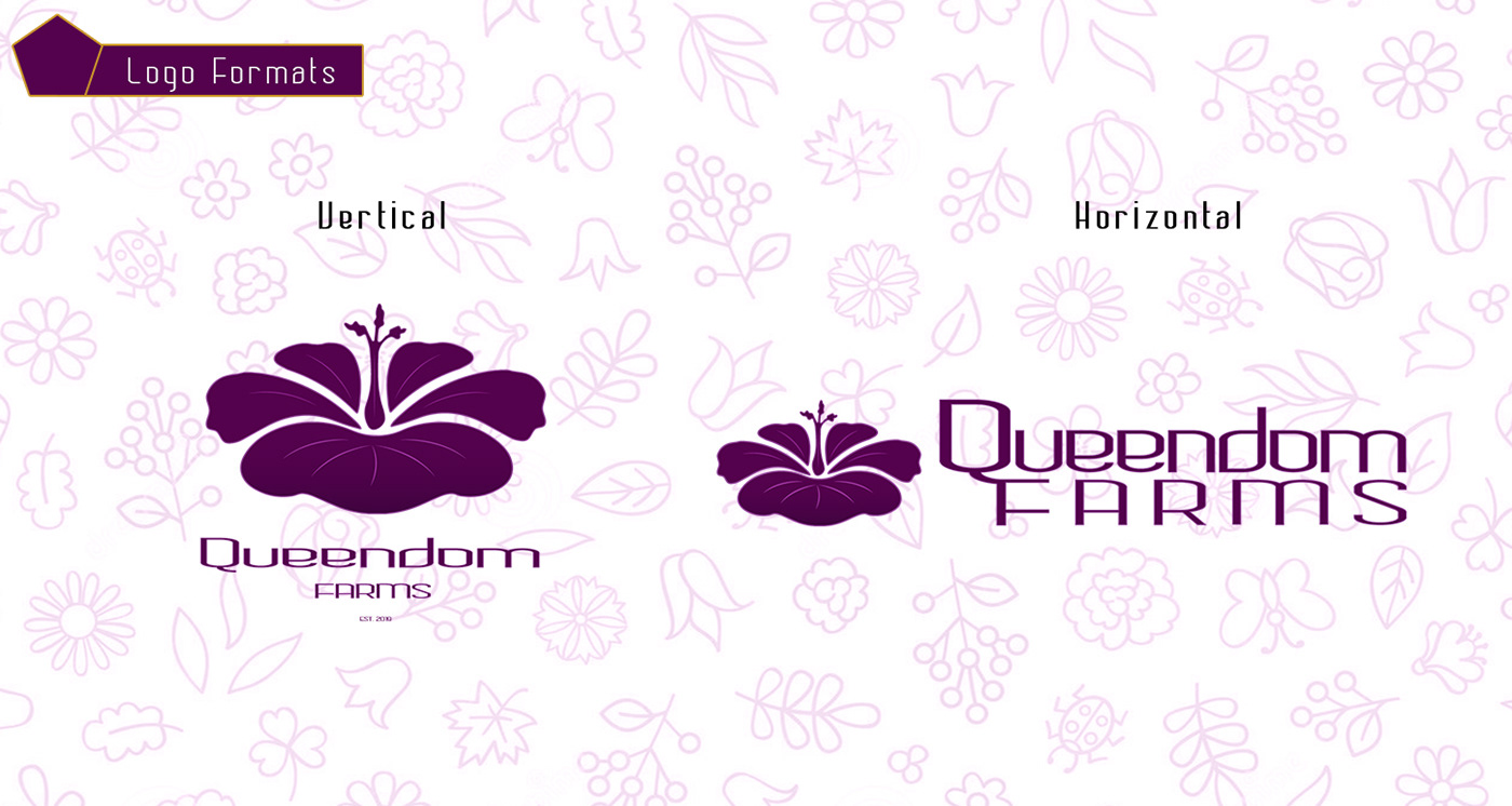
Formats
Multiple logo file types and layouts for flexible use across packaging, web, and print. — Designed for versatility, logo assets were delivered in various formats to ensure consistency across digital, print, and product-based branding.
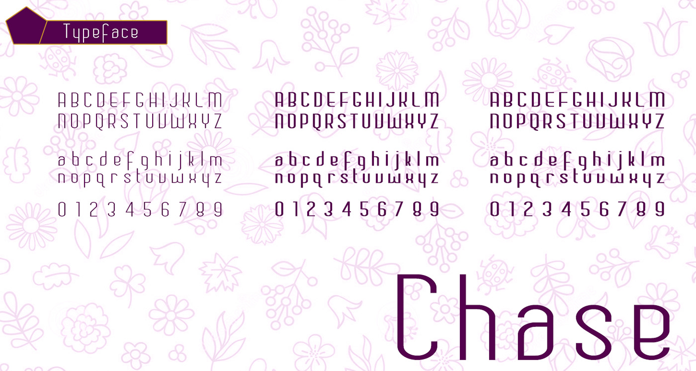
TypeFace
A custom font pairing chosen for legibility and style, reinforcing the brand’s grounded tone. — This clean yet grounded font pairing was selected for readability and warmth that would go on to support brand storytelling across packaging, signage, and digital platforms.
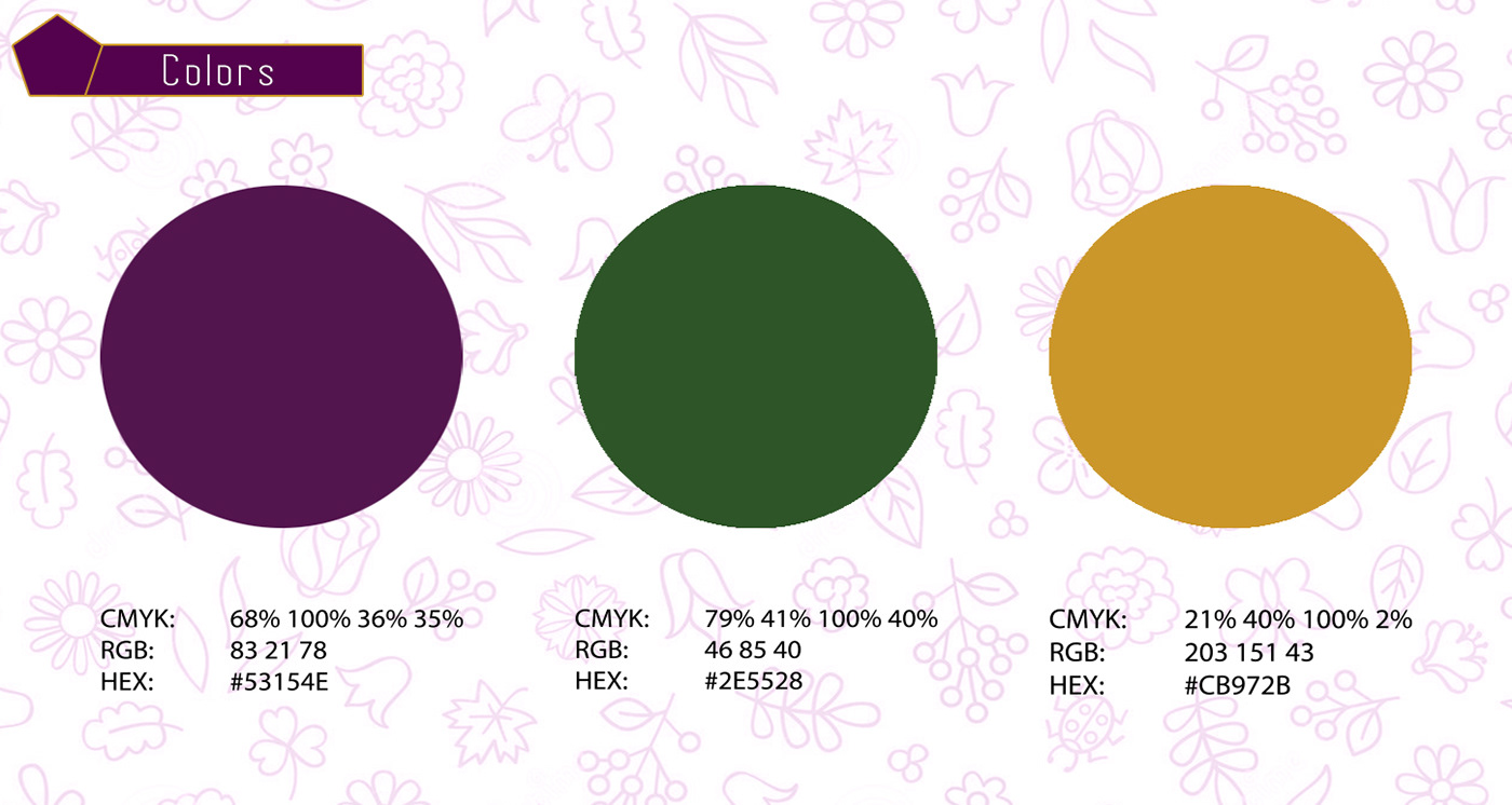
Colors
A warm, earthy color palette inspired by organic growth, soil, and harvest seasons. — An earthy, seasonal palette communicates authenticity and sustainability while enhancing recognition and emotional resonance with the target audience.
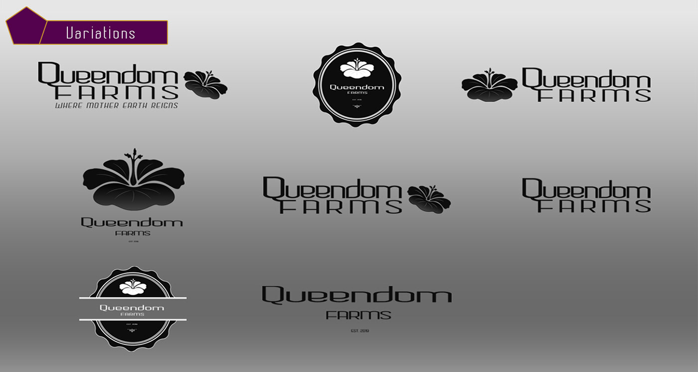
Logo Variations
Alternate logo versions optimized for light, dark, small-scale, and vertical applications. — Each variation ensures brand consistency across all environments. Whether on small-scale tags, dark-mode websites, or vertical packaging, we wanted to make sure all bases were covered for these underdogs and soon-to-be champions.
Moodboard
An extended brand moodboard showing lifestyle inspiration, textures, and tone. — This extended board reinforces the brand’s visual direction, drawing from real textures, natural settings, and lifestyle cues to support design decisions.
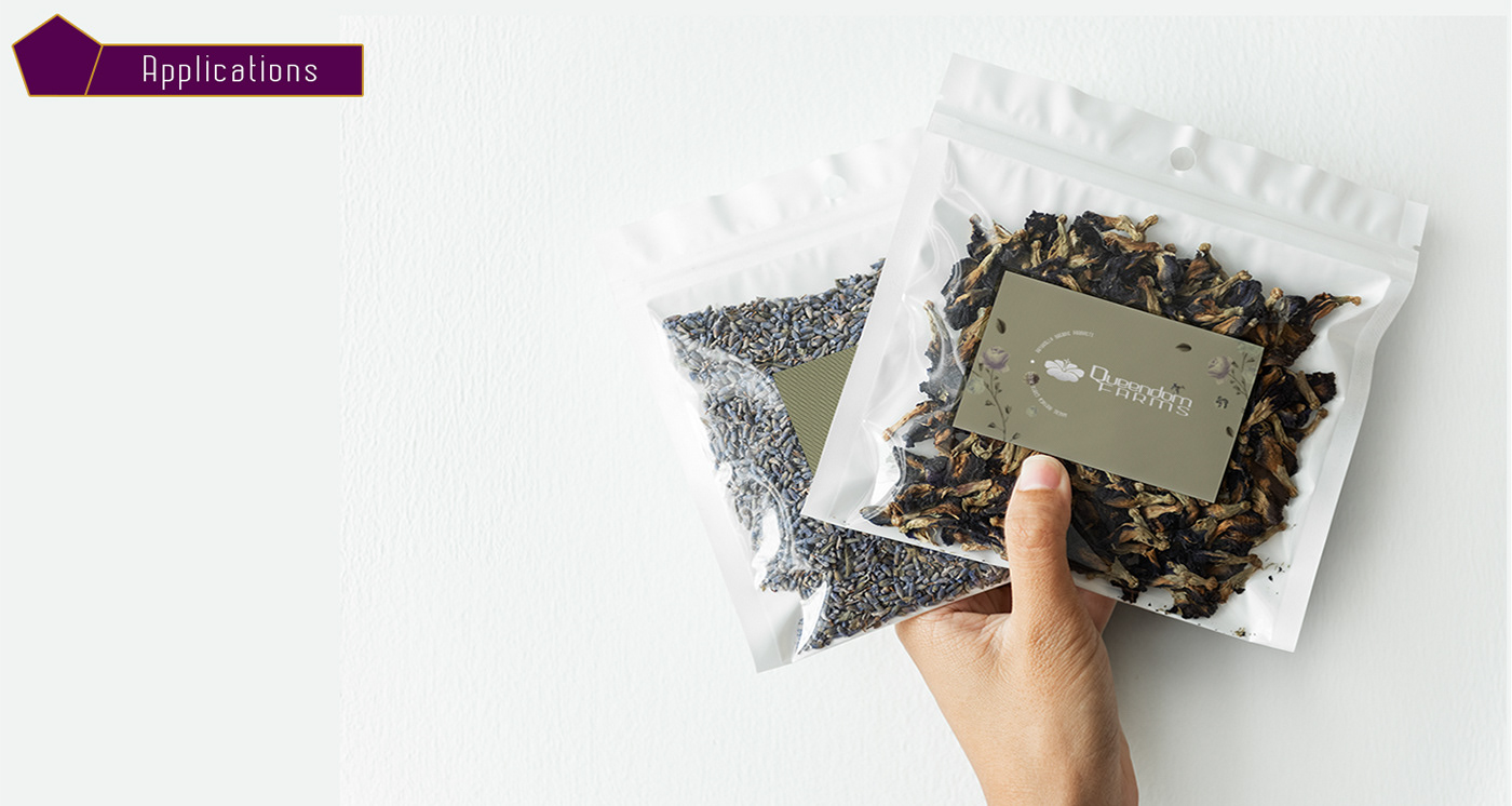
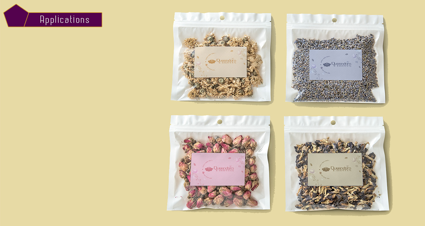
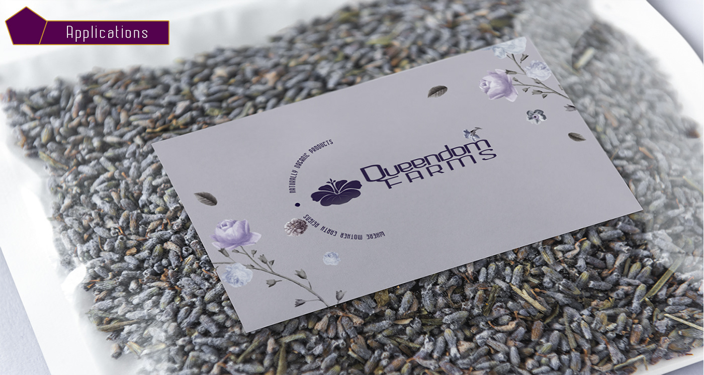
Brand Application
Real-world mockups of the Queendom Farms brand across packaging, merchandise, and social media.
Brand Application
Real-world mockups of the Queendom Farms brand across packaging, merchandise, and social media.
Brand Application
Real-world mockups of the Queendom Farms brand across packaging, merchandise, and social media.