Brief
Consolidated Construction Solutions is a Houston-based, family-driven firm offering architectural and construction services across both residential and commercial markets. Built on trust, craftsmanship, and professionalism, the brand needed a refined identity and online presence to reflect its values and support future growth.
Goals:
• Build a clean, trustworthy brand for residential and commercial clients • Launch a website with scheduling, quote generation, and project showcase • Create branded materials for on-site, digital, and social visibilityChallenges:
• Balance a professional tone with family-oriented values • Appeal to a broad audience—from homeowners to commercial developers • Deliver a full brand system within a limited timeline and budgetSolutions:
• Designed a refined identity using warm, business-class color tones • Developed a responsive website with key client-facing features • Delivered a full branding package: stationery, apparel, magnets, and social templates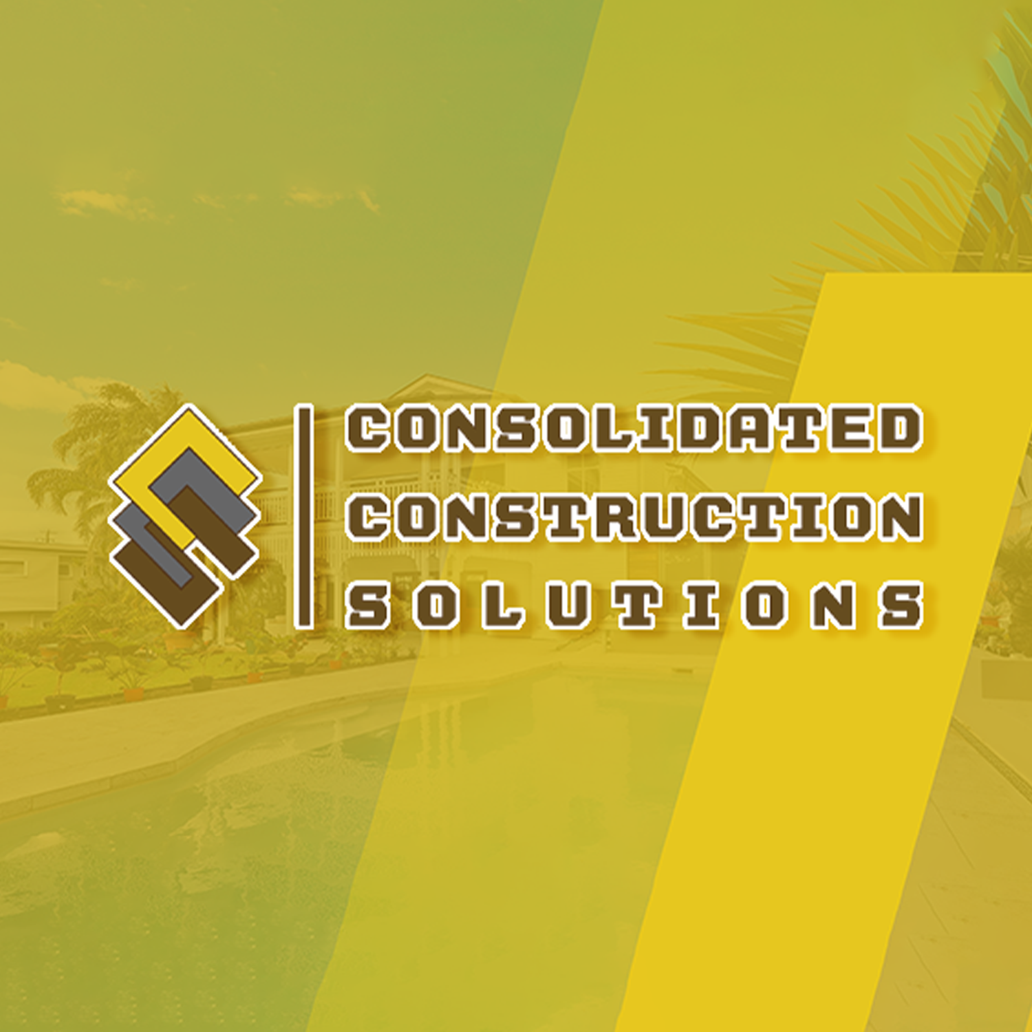
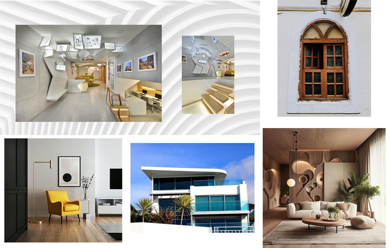
Moodboard
A visual direction board reflecting the brand’s clean, professional aesthetic and construction industry roots. — Curated to evoke reliability and precision, the moodboard established a visual tone rooted in structure, professionalism, and the no-nonsense aesthetics of commercial and residential construction.
Sketch & Prototype
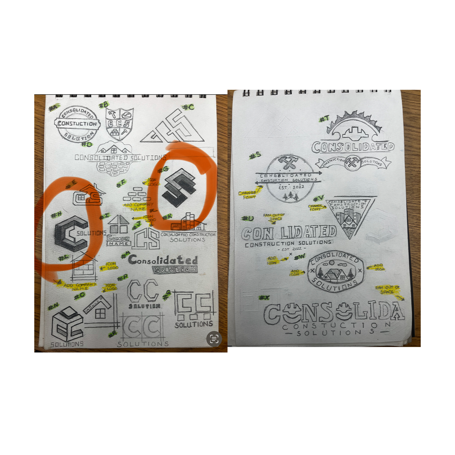
Hand-drawn sketches were used to explore foundational imagery such as emblems, framing structures, and monogram concepts that aligned with the brand's emphasis on precision, strength, and reliability. -- Early sketching explored structural forms and bold shapes, which drew inspiration from elements that the client provided, using framing beams, shapes, and blueprint geometry. The goal was to create a visual foundation that felt solid, recognizable, and deeply tied to the industry.
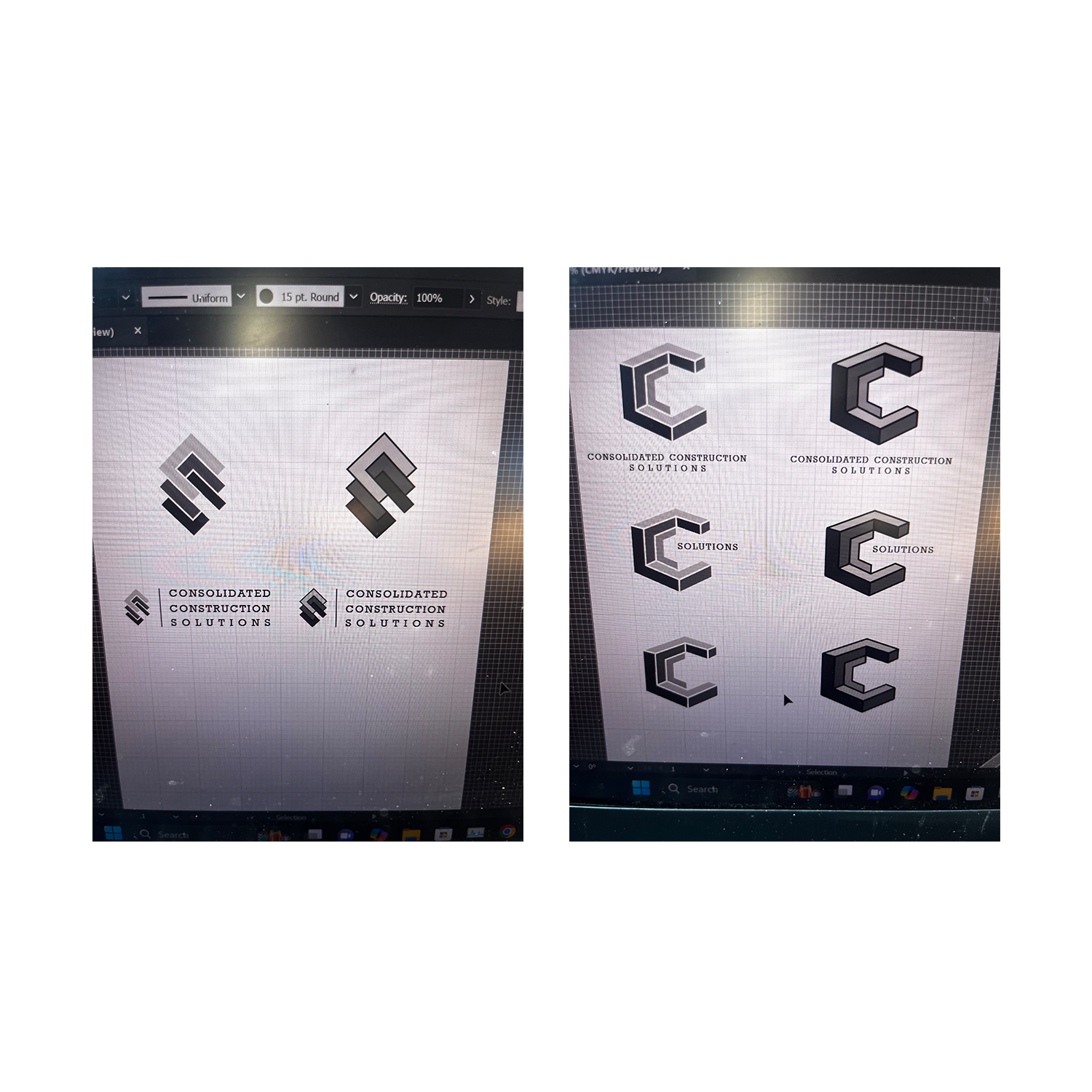
Sketch & Prototype
Digitally rendered prototypes refined to meet the standards of clean linework, sharp edges, and scalable composition to test against real-world applications. -- The prototyping phase served as a stress test for the brand’s visual identity. Each variation was evaluated for legibility at multiple sizes, color contrast for field visibility, and visual harmony within layout constraints typical of construction signage and corporate collateral. This ensured the final mark wouldn’t just look good in isolation but in environments where the brand would live and operate.
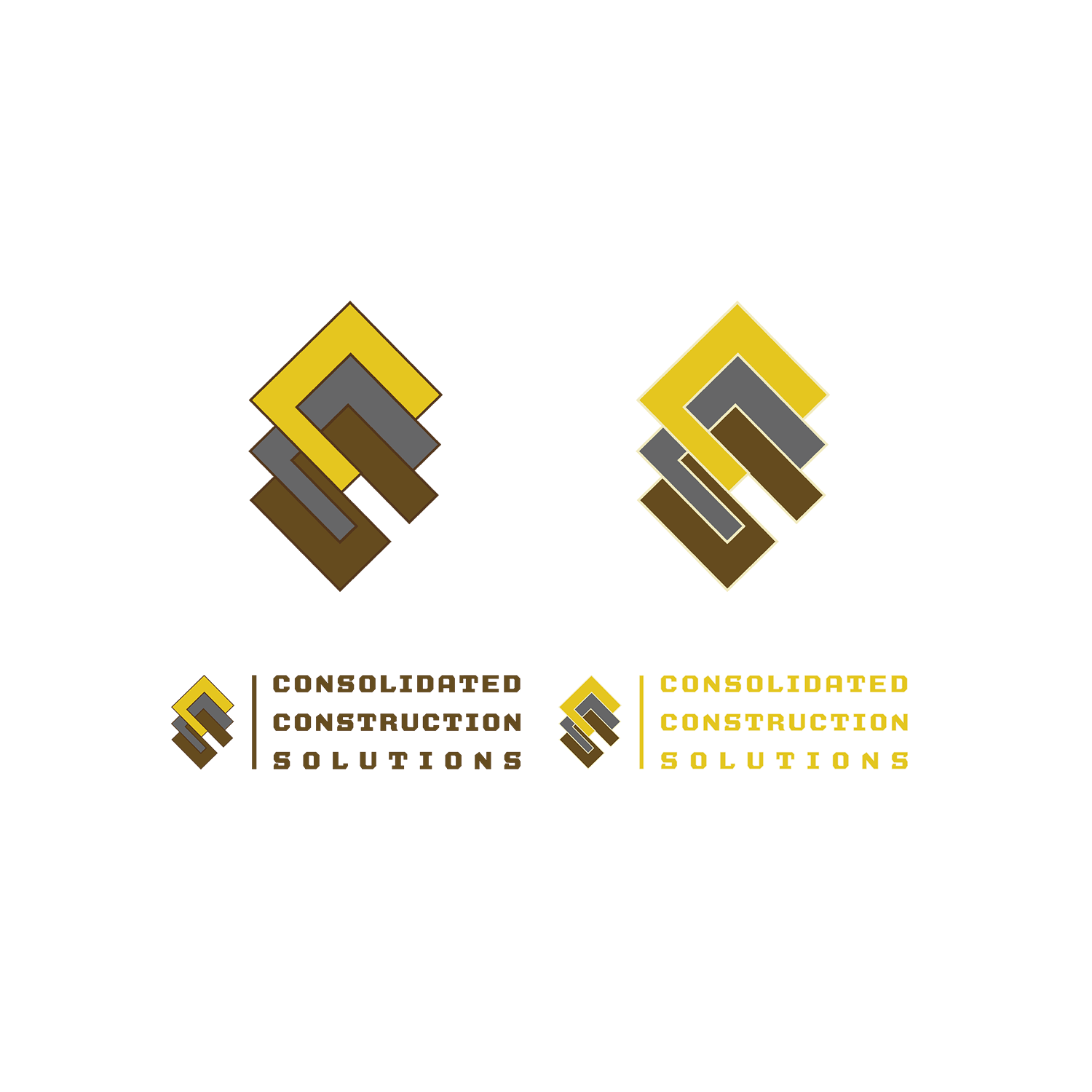
Logo Formats
Primary and alternate logo formats built for flexibility across digital, signage, and print applications. — The selected mark balances corporate polish with industrial grit, optimized in multiple formats to ensure clarity and consistency across print, apparel, digital interfaces, and environmental branding.
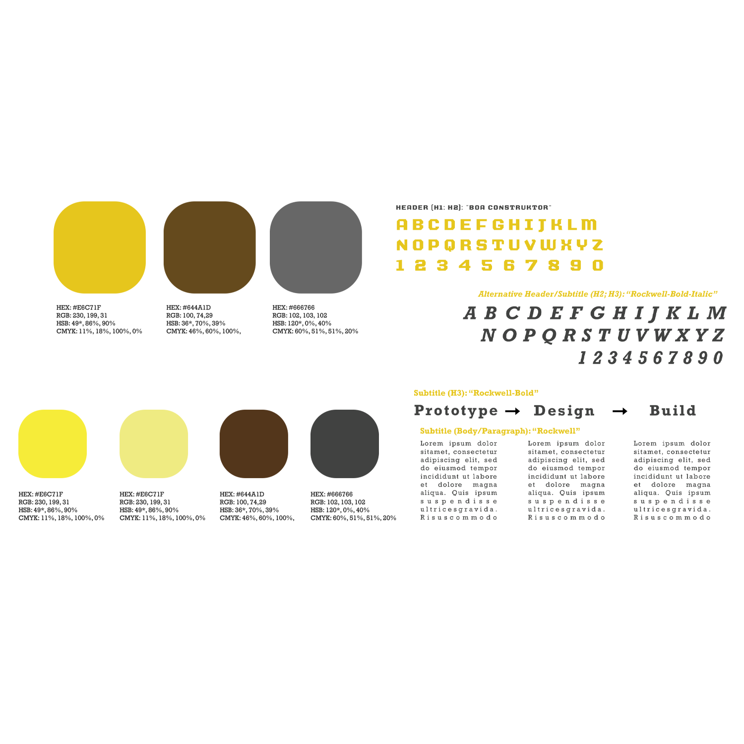
Company Colors & Typeface
A business-forward color palette and sturdy typeface selected to convey trust, structure, and professionalism. — A canary yellow to capture attention, a chestnut brown to establish trust and reliability, and a steel gray palette was paired with a strong, utilitarian typeface to visually reinforce the brand’s commitment to integrity, craftsmanship, and professionalism in the construction space.
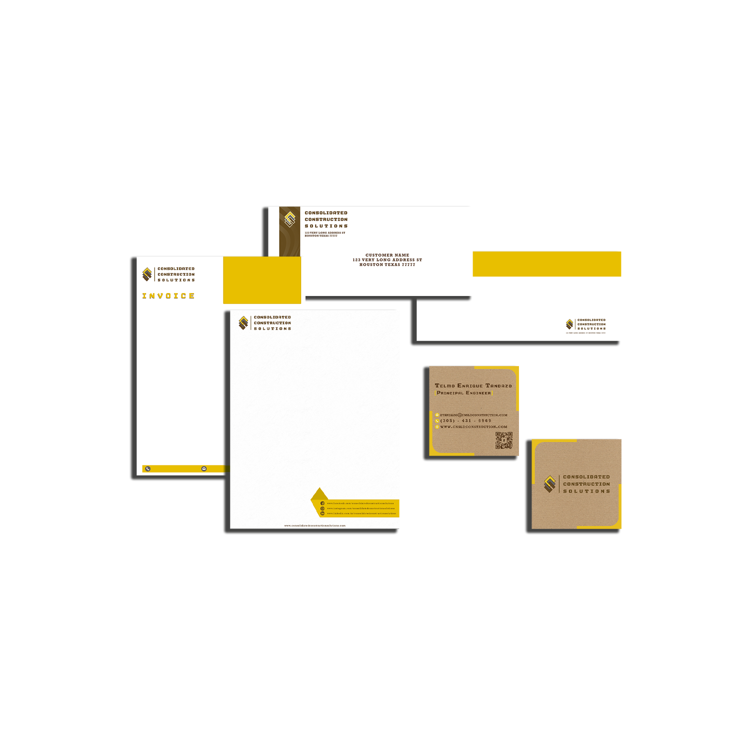
Stationery Kit
Branded stationery designs including letterhead, business cards, and job-site documents for a unified identity. — Branded business materials were designed to carry the same sense of order and clarity, streamlining the company’s client touchpoints while maintaining an environmentally friendly business by using recycled paper to maintain a consistent visual identity on-site and in the office.
Brand Application
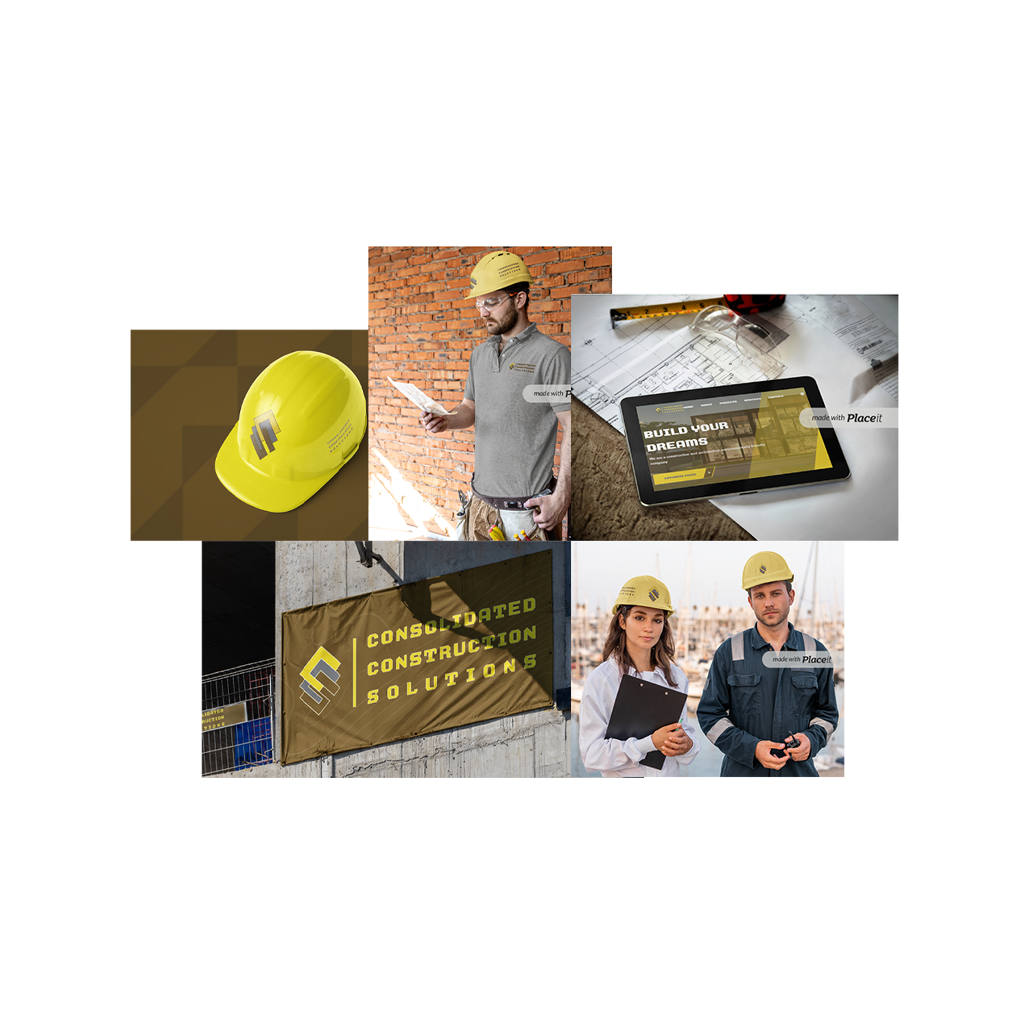
Mockups showcasing the logo applied to work shirts, company gear, and banners. — Realistic brand mockups were applied across high-impact surfaces, like crew uniforms and banners, to showcase the brand’s cohesion in client-facing and operational contexts, increasing brand recognition on job sites.
Web Application
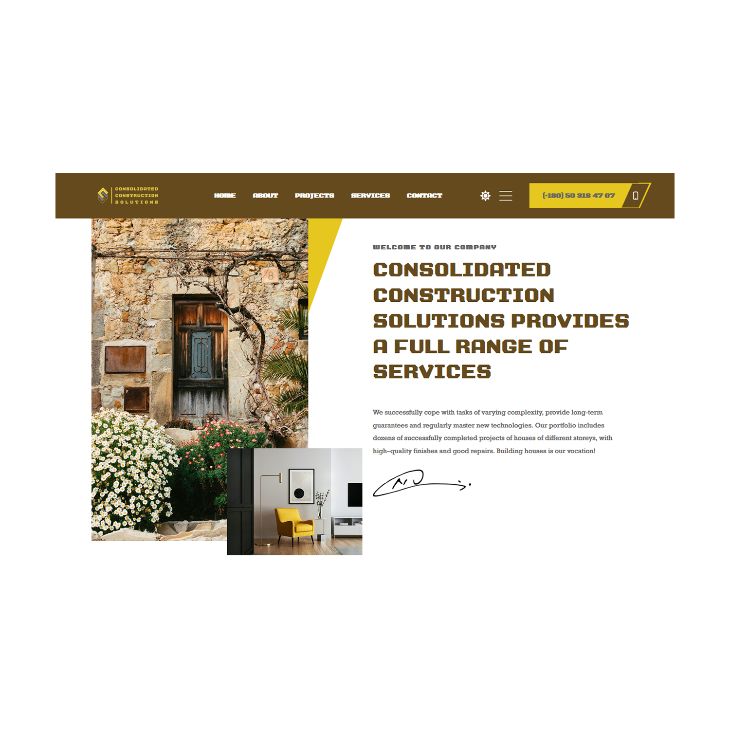
A user-friendly website concept with scheduling, quote generation, and project showcase features. — Designed with conversion and usability in mind, the site concept integrates intuitive quote requests, service explanations, and visual project showcases to improve trust, navigation, and lead generation.
